

Don't Lose Your Own Style just to Cater to the Times
I recently replayed Capcom's Ace Attorney on Steam. In fact, this is something I have wanted to write about ever since I first played it, and again when I played Ghost Trick earlier this year, which was also produced by Capcom.
Anyone familiar with these classic Japanese game companies knows that many of them originally built their success on gaming consoles such as the Nintendo DS and PlayStation 2. Back then, there were no RTX 5090 graphics cards, and personal computers were far less powerful than they are today, so these consoles played a major role in entertainment.
As for these Japanese games, speaking purely from my own perspective, I find many of them fairly mediocre. Their stories are often childish, very "Japanese" in their sensibilities, and quite superficial. I often wonder why Japanese creators seem so skilled at writing stories that feel juvenile, even when the writers themselves are not particularly young. Much of the content appears to exist primarily in service of commercialization—selling merchandise, promoting a specific character, or encouraging fans to support a particular couple.
Today, many of these companies can no longer compete on their own terms. New studios have emerged with stronger artistic direction, larger production scales, and more advanced technology. As a result, they have increasingly relied on porting classic titles to Steam or newer generations of consoles and selling them again. At the same time, they often seem reluctant to create genuinely new works.
Of course, I understand that video games are fundamentally an industry. Unlike film—which, despite its commercial nature, can still preserve artistic value and a strong authorial voice—games are primarily industrial products. So I understand that a game is developed for commercial purposes. Whether a studio uses flat cel-shading, Western-style painterly rendering, or Japanese-style painterly rendering, these are ultimately just different visual approaches. Every artist has a different understanding of character proportions and aesthetics, but at the end of the day, the work still serves a commercial objective. That is why I do not really buy into the claim that "the artwork I made for this game is art." It is not; it is a commercial product.
And if these games exist to serve commercial goals, then companies that are re-releasing classic titles from more than twenty years ago should be asking themselves a simple question: when the writing, music, and visual presentation of these older games are all significantly weaker than those of contemporary works, how can they maximize profitability?
Take Ace Attorney as an example. The original Nintendo DS version from twenty years ago had a very low resolution, pixel-based visuals, and rough-sounding music with a strong 8-bit character. The current Steam version, however, has been cleaned up and restored into an extremely polished, modern presentation.
I believe this approach is fundamentally mistaken.
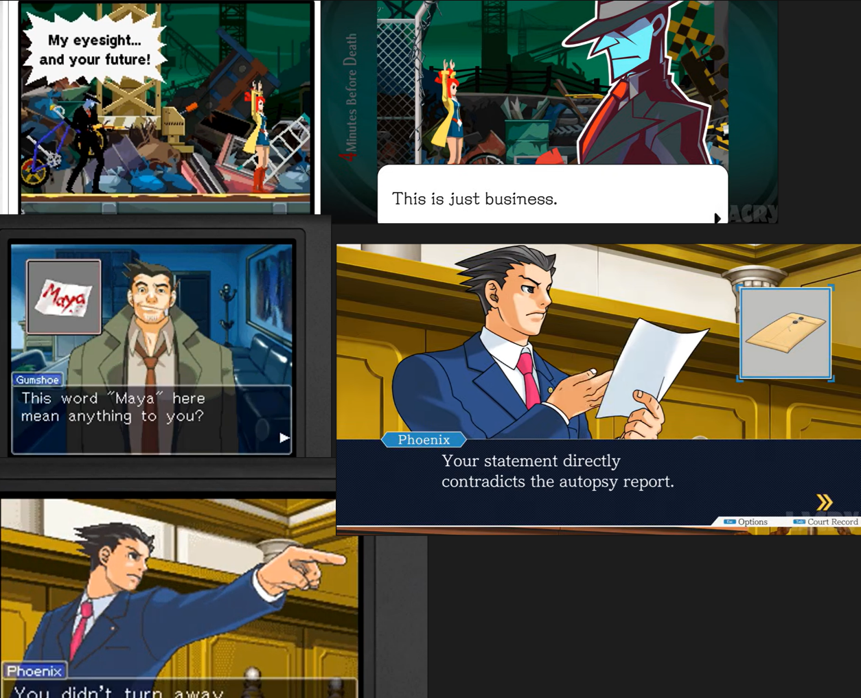
For example, in the image above, the screenshots on the left are from the Nintendo DS versions of Ghost Trick and Ace Attorney, while the images on the right are from the newer remastered versions.
As you can see, the original NDS versions relied heavily on pixel art. By today's standards, the visuals could certainly be described as rough and technically primitive. However, compared to most Japanese visual styles, this kind of coarse, unpolished pixel art possesses a very distinctive character. It has a unique retro charm that immediately sets it apart.
The same applies to the music. The original NDS versions featured extremely limited audio quality, both in terms of recording fidelity and frequency range. Everything sounded rough, compressed, and unmistakably 8-bit. Yet that imperfection was precisely what made it work. The audio matched the visual style perfectly, creating a coherent retro aesthetic.
The remastered versions on the right, however, clearly have a problem. The art style feels awkward and inconsistent. In fact, I would go as far as to say that it has become too generic. That was my immediate reaction when I first saw the Steam release. It looked so ordinary that I decided not to purchase it at the time, especially considering that it was not particularly cheap.
As visual novels, these games are already operating with a significant disadvantage in terms of storytelling. Part of that comes from the target audience, but another major factor is the inherent limitation of the format itself.
Why can the writing, characters, and worldbuilding of a AAA game such as The Witcher 3 reach their full potential? Because it is fundamentally an RPG. The player is allowed to explore the world firsthand and become immersed within it.
With visual novels, however, I never experience that same sense of immersion. The genre is, after all, still a "novel." It simply happens to be written from a first-person perspective and accompanied by visual elements.
If the storytelling is limited by the format, then the only areas left that can truly stand out are the music and the visual presentation.
Below are several Japanese visual novels that I personally consider visually impressive.
The first is ATRI -My Dear Moments- (2020), the second is LOOPERS (ルーパーズ, 2021), the third is ランス9 ヘルマン革命 (2014), and the fourth is Ghostwire: Tokyo – Prelude (2022). The last one was created as promotional material for a AAA title rather than as a full-length visual novel, but I still think it serves as a useful example.

Aside from ランス9, which was released more than a decade ago, all of the other titles are relatively recent. Finding visual styles that I genuinely like is surprisingly difficult, because Japanese anime-inspired aesthetics have become so heavily homogenized. Personally, I find that trend quite frustrating.
I do not particularly like the writing in any of these games. Most of the stories feel overly childish, with the exception of Ghostwire: Tokyo – Prelude. As I mentioned earlier, that title had excellent visual direction and did a very good job of foreshadowing elements of the AAA game it was promoting. Unfortunately, the game itself suffered from a very low level of completion. The map was too small, invisible walls were everywhere, and for an RPG, the inability to freely explore the world was a serious flaw. The studio eventually shut down as well.
What these examples demonstrate is that even when the writing is weak and the characters remain relatively shallow, the artwork is at least visually appealing. In fact, I would argue that many people buy these games and their merchandise primarily because of the art.
The music is generally decent as well, but since it is largely commercial in nature, there is not much to analyze. At best, it is a matter of finding the tallest person in a crowd of short people. Most commercial soundtracks follow very similar formulas and rarely distinguish themselves from one another.
This brings me back to Ace Attorney. Why was the remastered version redesigned in such an ordinary-looking style?
My suspicion is that Capcom became too anxious.
Today, the visual quality of modern games is visibly higher than ever. AAA games, especially what I would call "Canned Games"—large open-world titles that rely on repetitive content and assembly-line production methods—often have extremely polished presentations. They look impressive on the surface, but beneath that surface they frequently rely on the same recycled formulas. Ubisoft's Assassin's Creed series is a good example.
Faced with this environment, Capcom may have felt that the rough pixel-art style of the original games could no longer compete visually, so they attempted to modernize the presentation by replacing it with a cleaner and more standardized aesthetic.
The problem is that these games are already more than twenty years old.
Younger players either have no idea what these games are, or they might only engage with them out of curiosity. Most are unlikely to sit down and seriously experience the story. After all, I do not particularly want to reread books that I finished ten years ago, either. Many of their themes, assumptions, and contexts have simply aged.
The natural audience for these ports is therefore the generation that originally played them twenty years ago.
And when those players return to these games today, they are not doing so in order to relive the excitement of a first playthrough. The stories are already deeply familiar. Even if they cannot remember every detail, they certainly remember the major twists and key moments.
What they are buying is nostalgia.
But instead of embracing that nostalgia, Capcom chose to follow what it perceived as the market trend. In doing so, it discarded one of the most distinctive aspects of the original games: their retro visual identity.
Worse still, the original pixel-art aesthetic was never particularly suited to being transformed into a clean, modern flat-color style. As a result, the remaster loses much of its personality while gaining very little in return.
From a commercial perspective, that puts the product at a disadvantage. The company becomes increasingly dependent on merchandise sales, yet the visual redesign itself limits the potential appeal and expansion of that merchandise.
The only situation in which a modernized aesthetic truly makes sense is when creating an entirely new title.
Take The Great Ace Attorney as an example. Although the first game was released in 2015—already eleven years ago—it was still a comparatively modern production rather than a relic from the early 2000s. Because of that, its clean and contemporary art style feels natural rather than forced. The character designs are also excellent. In fact, I even purchased the art book illustrated by Kazuya Nuri.
But that is not what Capcom did with Ace Attorney.
They were not creating a new game. They were porting a twenty-year-old game to modern hardware.
Under those circumstances, when audiences are already willing to embrace a wide variety of artistic styles, abandoning the very retro identity that originally made the game distinctive and forcing it into a cleaner, more contemporary aesthetic ultimately serves little purpose.
The result is not a stronger product. It is simply a less distinctive one.